3 must-haves for a Show-Stopping Custom Website Design
How do you know if you’re really ready for a custom website?
You see a friend post about her new custom website and it’s GORGEOUS (*cue Taylor Swift song playing in your head*). It has everything you want! Amazing graphics! A beautiful logo! Stunning photography! Perfect wording that you instantly connect with! You get so excited and say I’M IN! I WANT THAT TOO! You reach out to the website designer you’ve had saved in your bookmarks saying you’re full steam ahead. You book a free discovery call, hop on ready to book that moment and then quickly realize after a few questions that you don’t have everything together that you thought you did.
Have no fear! Here’s a quick run down of a few things you should be prepared with for your awesome biz before it’s time for a custom website investment:
1. solid branding
And by branding, I don’t just mean a logo. Before it makes sense for you to invest in a custom website, you need to know your business inside and out. What is your mission? Who is your audience? What is your voice? And by branding, I ALSO mean logo, color palette, elements and patterns that resonate with your business and tells your story. These are all key components in bringing your website together to be that beautiful, show-stopping and CONVERTING website of your dreams. When you see a cohesive website that just OOZES #websitegoals, I can guarantee you they put in the before work to make sure they had this part solid as a rock before they moved forward!
One caveat here is that there are lots of website designers who are also brand designers! This is totally a personal decision on who you mesh best with and who you want to work with! I used to offer branding design as well but I dropped it a few years ago because I wanted to be able to solely focus on websites and become an expert at that!
My favorite branding designer? Hands down Kindly by Kelsea.
2. Branding Photos
I know at this point you’re probably thinking… “Okay Chelsea, all I see here is $$$ so far”. And to be honest - you’re not wrong. But all of these steps are each as important as the next to bringing your website to life! The first time I finally invested in branding photos my website went from okay to WOW. Great visuals are KEY in the vibe your website is going to give off. I could create an incredible design, but it will fall flat without photos that SHINE.
What photos should you be looking for from a brand shoot? Here are a few ideas:
Portraits of you are a MUST! We need to see that beautiful face behind the brand. People identify with other people and faces - we need to see you (whether you like being the face of your brand or not! ;))
You in action with your business.
Your product or a way to show off your product
Detail shots! Hands, computers, notebooks, pencils - whatever it is that makes sense for your brand
Horizontal and vertical options
3ish outfit changes and a few scenery or setup changes (you don’t want to be in the same outfit in the same place in every photo!)
When you’re choosing a photographer make sure their style matches your brand. If you hire a moody photographer who loves black and white and your brand colors are hot pink and purple.. that might not work out the way you would hope :)
You can also repurpose these for Instagram posts, Pinterest pins, etc. so make sure you get any fun shots you want too!
I know it’s an investment, I have been in the same boat! But dropping a few dollars on this now will return tenfold when your amazing new website is converting clients left and right!
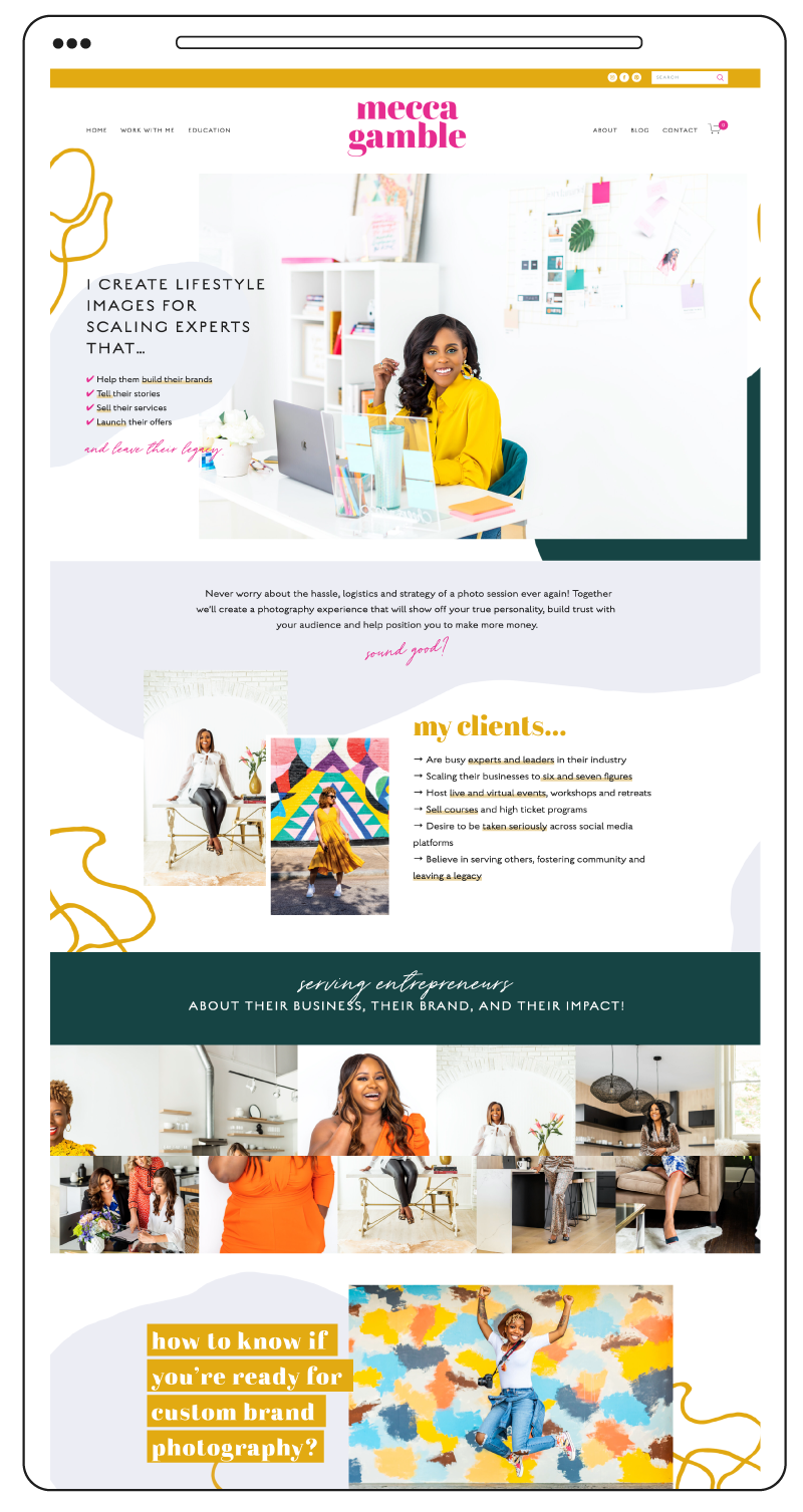
What to see an example of what I mean? Mecca Gamble is the boss of all bosses at branding photography.
3. Copy
A lot of the time words are the hardest part of a website for clients. I know they are for me!! You think “oh no problem I’ll just write out a few blurbs about what I do and we’ll be good.” And then you sit down to write and… crickets. It’s okay if this happens - we are not all perfect at all the parts of our business. Getting your mission, your product and your services out there explained in a way that makes sense and is clear and concise is.. you guessed it - KEY! If people don’t know who you are or understand what you do quickly they are on to the next. Your website copy should be engaging, full of your personality and CLEAR.
and that completes the trifecta!
When you apply to work with me on a custom site, my questionnaire asks where you are with all these pieces so I can get a good insight at what type of project would be best for you!
Also, just because you might not be ready to dive into a full custom website doesn’t mean you can’t have an AMAZING website! Maybe a Template Re-style or a one page website would be perfect for you right now! Most website designers have different packages depending on where you might fit best for their services, so always take a look and what they offer and what they need from you to get started.
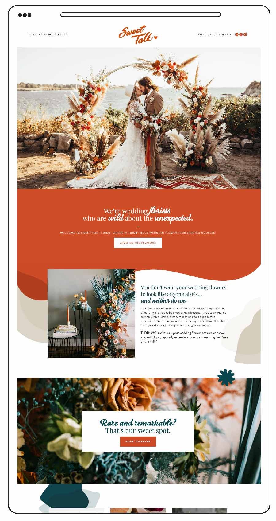
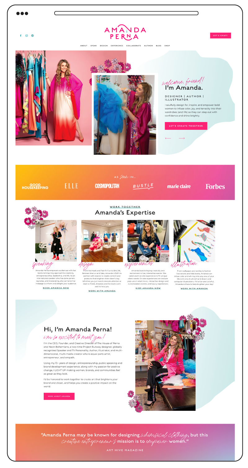
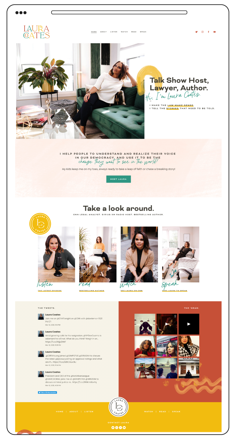
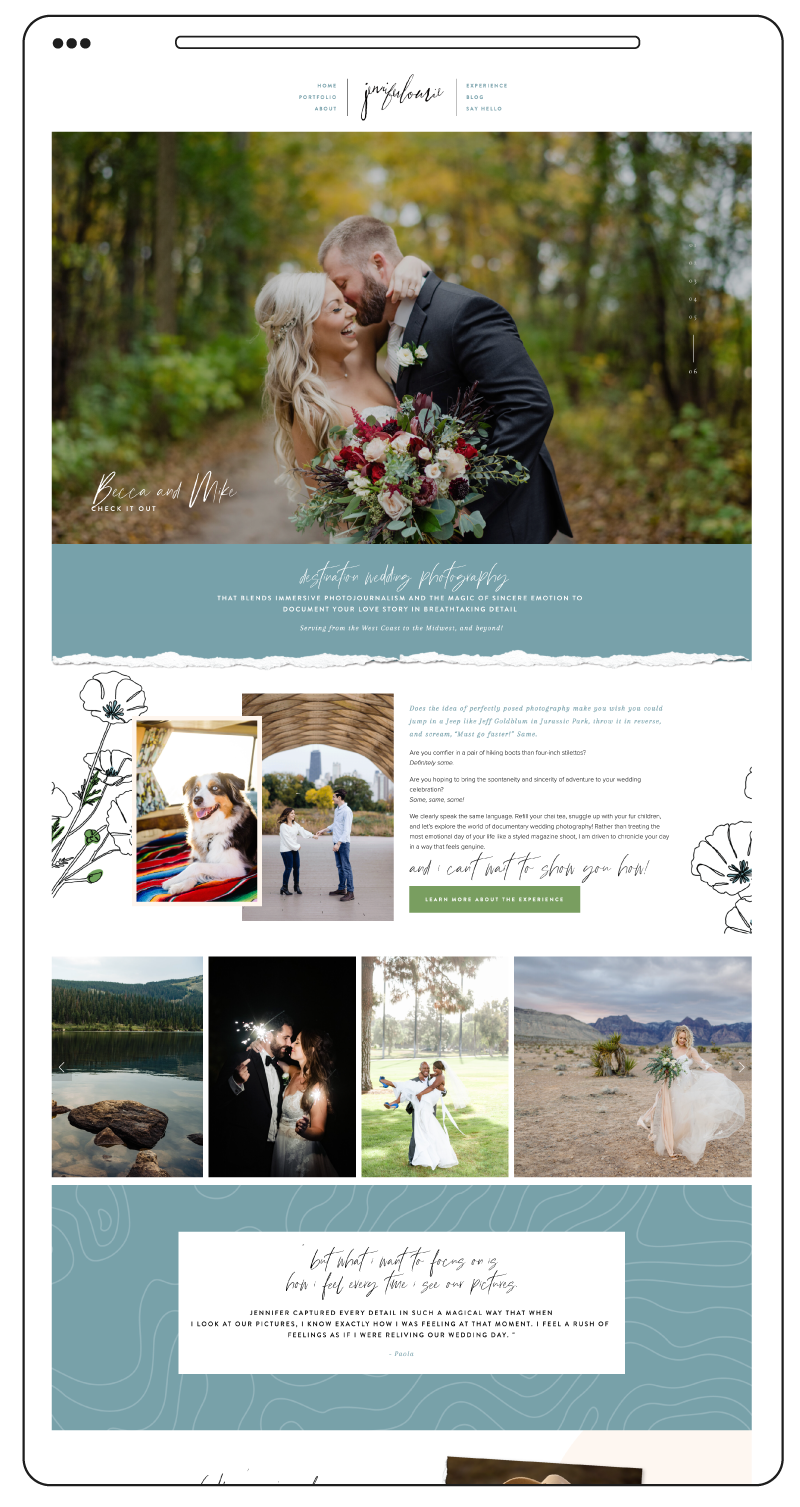
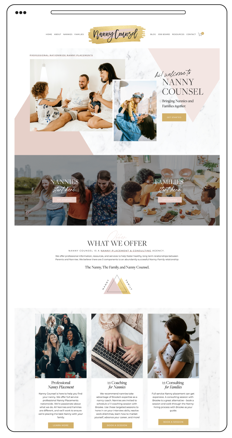
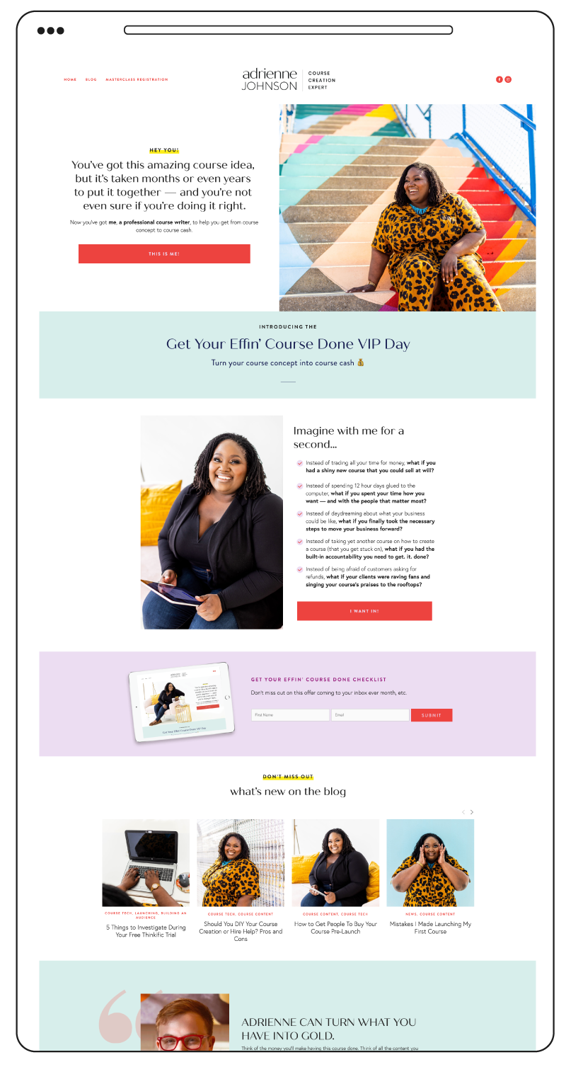
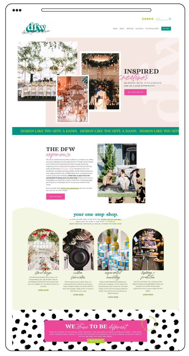
Have any questions?! I’d love to answer them! Here are a few of my favorite custom websites I’ve worked on this year that I think show off the website magic that can happen when the trifecta is complete! Think you’re ready to take the custom website dive and Interested in working with me? Hop on over here to apply!
