An intro to Squarespace Fluid Engine
In the summer of 2021 Squarespace launched their newest editing system called “Fluid Engine”. I will admit that at first, I wasn’t quite ready to hop on the bandwagon… which also happened when Squarespace launched their 7.1 editing system. Another new thing I needed to learn slowly crept to the bottom of my to-do list. But after I played with it for about 3 minutes I realized that it was a game-changer for designers and small business owners alike. Soooo what exactly is it? Here are a few of my favorite updates, features, who it’s for and if you should use it!
Note: Fluid Engine can ONLY be used on websites originally created in 7.1 NOT 7.0.
How Squarespace Fluid Engine Works
Unlike the classic editor in 7.0 or 7.1, Squarespace Fluid Engine allows you to drag and drop elements anywhere you want on a page! Without code (or having to create images in Canva or Photoshop), you can overlap elements and move them around on a very flexible grid without being stuck in the boxiness of the old editor. Another huge win with Fluid Engine is editing the mobile design separately from the desktop design (insert GASP here!). Basically, it’s MAGIC ✨
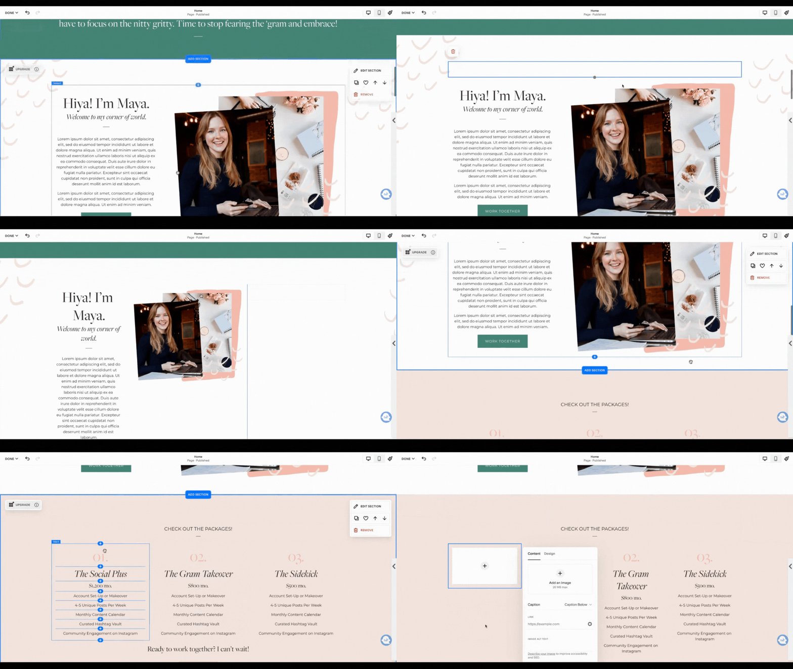
Here’s a look at the difference while designing a site:
Squarespace 7.1
Every block moves on a very strict invisible grid. Blocks can only be placed on the sides or top and bottom of each other, not overlapping.
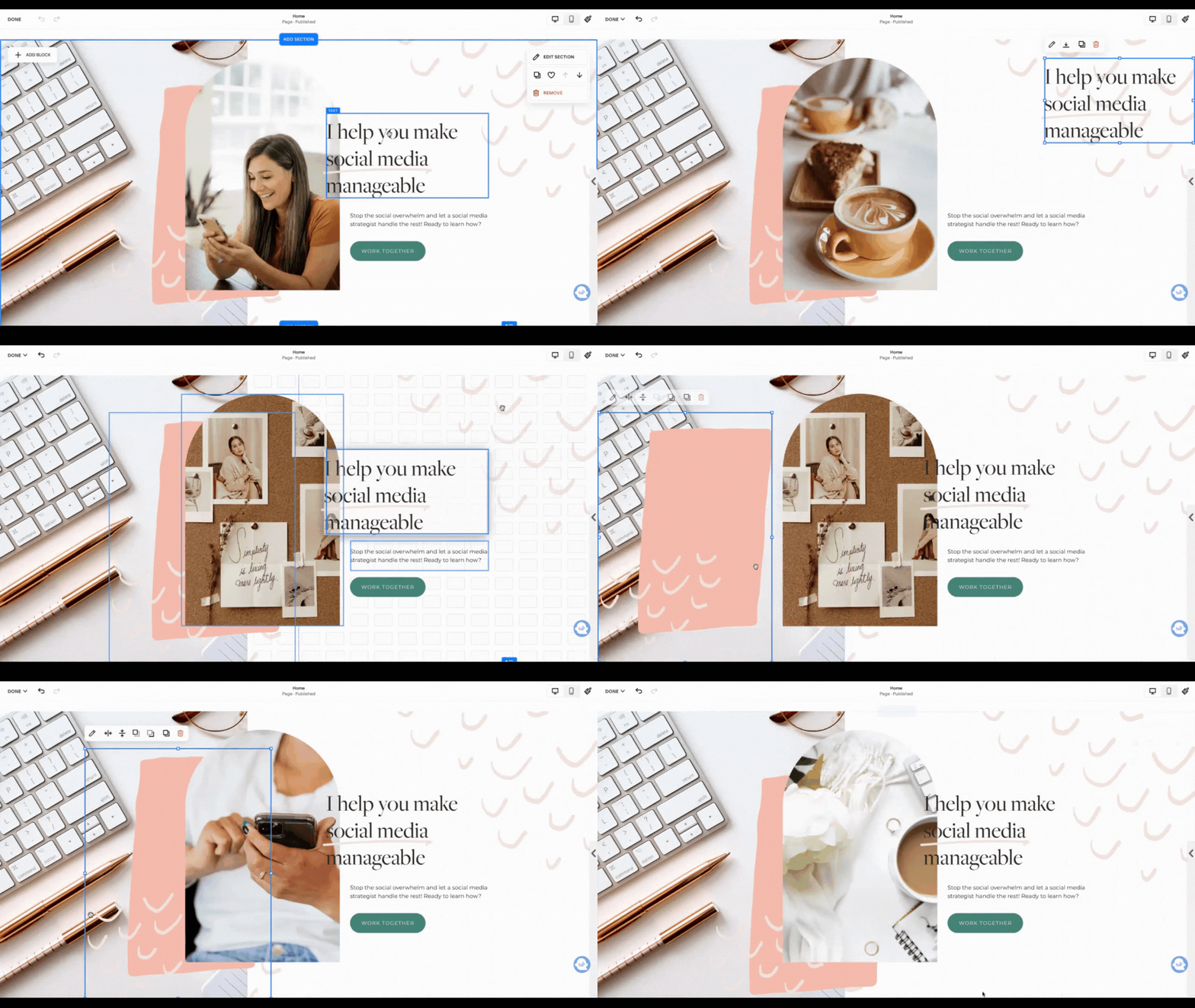
Squarespace Fluid Engine
All blocks can be moved anywhere on the page. Blocks can be placed on top or bottom of each other making them be overlapped.
3 favorite Squarespace Fluid Engine features
1. Say hello to mobile editing!
This is a feature Squarespacers have been asking for probably since the platform was created... and here it is! You can move around elements and completely redesign the layout of your website within the mobile view. What you cannot change on mobile is the size or style of text or change the actual words/add different features only on mobile (unless you are coding of course). Here’s a quick look at this magic:
2. No more spacers or rigid image block designs
In the old versions of Squarespace you would have to add padding or adjust where photos/text boxes were by adding “spacer” blocks. Sometimes you had to get pretty creative with them to get things to line up exactly where you wanted them to. But with Fluid Engine that is no more! Since you can move things around basically wherever you want them, there is no more need to add spacer blocks! And speaking of that, image block designs aren’t needed either! Want to overlay text on a photo? DO IT! You can drag a text box overlapping a photo and send it behind or send it to the front with the click of a button. No more having to adjust spacings in image block styles and be stuck with one look throughout your whole website.
3. Edit the grid in each section
Each section you add to your page can have its own unique grid and spacing! Changing the grid can give you a different look - more or less space between blocks vertically or horizontally. You can also change the top and bottom spacing on each section giving more or less padding between each section. You can get as nitty gritty or as basic as you would like with the grids! With one of the other newest features in Squarespace - “Saved Sections” - you can set the grid you like, save it and then use it as a base for each new section you add!
A bonus favorite!
A new feature in Squarespace is that you can align blocks to be centered, top aligned or bottom aligned. In 7.1 you can do this with image blocks, video blocks and buttons but NOT text blocks. In Fluid Engine you can! I love this feature and it makes it so much easier to align things juuuust perfectly (especially for my Squarespace designers and template makers out there!).
Should I upgrade to Fluid Engine and how do I do that?
Upgrading your Squarespace 7.1 website to Fluid Engine may not be for everyone. Although it gives you more power to design, it may be too much if you’re not very comfortable with website design. If you have a 7.1 website that has not been upgraded yet, you will always have the opportunity to, but you don’t HAVE to.
If you do upgrade a current 7.1 website it will shift a few things here and there that you will need to fix. For instance, image block designs will convert a little funky and the spacings may need to be adjusted. To convert a current website to Fluid Engine, you will see an “UPGRADE” button in the top left corner of each section on your website. Click that and it will upgrade! But just know you CANNOT go back. I would suggest making duplicates of each of your pages and keeping them in your Not Linked pages before doing this just to be on the safe side.
Want some help converting your website? I am hosting a FREE live workshop on how to upgrade your current 7.1 website to Fluid Engine on January 27th at 12:00pm EST! If you can’t make it live, no problem. There will be a replay as well as long as you are signed up!
If you’re starting a brand new website, the sections you add will automatically be in Fluid Engine unless you choose to add a blank section with the “classic editor”.
Overall, I am SUPER excited about this huge improvement to the Squarespace editing system. For designers and clients alike! What do you think about it? Have you tried Fluid Engine? Let me know in the comments!


